spacer arrow 
photo


1 - The Universality of Human Rights.

1998 - Acrylic on Paper - 203cm x 185cm
Catalogue Ref: 980928


The image above, "The Universality of Human Rights", is based upon my sketch submissions for a cover design for the Amnesty International Annual Report of 1999 which the late Gillian Noel commissioned me to design.

My design was deemed to be too abstract (I agreed) and so it was rejected. I later produced the painting in acrylic, for my Beldam Gallery exhibition.

Later, in 2010, the staff at Amnesty purchased the painting as a remembrance for Gillian. It now hangs in the newly refurbished Amnesty International Secretariat offices in London.
photo


2 - Shelf-Life.

1998 - Acrylic on Paper - 203cm x 185cm
Catalogue Ref: 980929


photo


3 - Weather Report.

1998 - Acrylic on Paper - 203cm x 185cm
Catalogue Ref: 980930


photo


4 - Pastor's Chook for Dinner.

1998 - Acrylic on Paper - 203cm x 185cm
Catalogue Ref: 980931


photo


5 - Ozone - 1.0 Bar - 100%.

1999 - Acrylic on Paper - 167cm x 152cm
Catalogue Ref: 990106


photo


6 - The Archaeology of Time / Time Traveller.

1999 - Acrylic on Paper - 167cm x 152cm
Catalogue Ref: 990107


photo


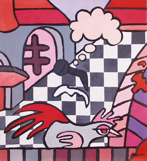
7 - The Parapraxis of a Chance Meeting at Heathrow Airport of RD Laing and Noam Chomsky.

1999 - Acrylic on Paper - 167cm x 152cm
Catalogue Ref: 990108


This, from Wikipedia, may be of some use:

"A Freudian slip, also called parapraxis, is an error in speech, memory, or physical action that is interpreted as occurring due to the interference of some unconscious ("dynamically repressed") subdued wish, conflict, or train of thought guided by the super-ego and the rules of correct behaviour."

"They reveal a "source outside the speech". The concept is thus part of classical psychoanalysis."

"Slips of the tongue and the pen are the classical parapraxes, but psychoanalytic theory also embraces such phenomena as misreadings, mishearings, temporary forgettings, and the mislaying and losing of objects."
photo


8 - The Poet's Room.

1999 - Acrylic on Paper - 167cm x 152cm
Catalogue Ref: 990105


photo


9 - Portrait of a Nationalist.

1984 - Acrylic on Board - 154cm x 123cm
Detail Digitally Remastered 2011.
Catalogue Ref: 111225 and 840005


This image has been extracted from a painting I submitted to a London County Council painting competition on the theme: 'London Against Racism'.

The original painting comprised 30 different portraits each representing a facet of racism (in London) as documented.

The painting was (rubbish and was) rejected but it contained some interesting ideas of which this is one.
photo


10 - Portrait of a Bureaucrat.

1984 - Acrylic on Board - 154cm x 123cm
(Detail Digitally Remastered 2011.)
Catalogue Ref: 840005 & 111224


This image has been extracted from a painting I submitted to a London County Council painting competition on the theme: 'London Against Racism'.

The original painting comprised 30 different portraits each representing a facet of racism (in London) as documented.

The painting was rejected but it contained some interesting ideas of which this is one.
photo


11 - May the Road you Ride be Kind.

2011 - Acrylic on Watercolour Paper - 100cm x 70cm
Catalogue Ref: 110791 and 110355
Collection: Andy & Daljit Babel, London.


I have always been facinated by signs and sign-posts. This is partly because they are reflective, imaginative semiotic indicators of something interesting that might happen in the future. Once the sign or sign-post is addressed, some human action must follow, which may include some thoughtful decision making. In a round about way therefore, the sign or sign-post is a rich human indicator. Something to do, perhaps, with the (philosophical/semiotic) notions of destiny, fate, fortune, prospects, expectations, chances.

But, interestingly, the sign(post) is a symbol of the temporal 'present'. The 'past' has been the journey to this point, the 'future' is what choice is made, the sign symbolises the 'now'.

On the other hand it might be even more interesting if the sign is not observed at all - but seen only as a representation - as in this picture. The subject here, the sign-post, becomes a sign in itself, of perhaps an opportunity to stop, consider, contemplate or reflect. Also in this composition, the signs on the sign-post also carry curious, possibly surreal, information which might just offer challenging and contradictory meanings.

Similarily, and of great philosophical importance to me, is that sign which stands unseen on some deserted road junction near some deserted place, could be like the proverbial tree falling in the forest with no one to hear it. (However, this might just be another stupid idea of mine.)

From a sentimental(-nonsense) perspective, I have always enjoyed the lines from the song, 'Call of the Wild' by Lindisfarne: (So, you don't have to be a hippie to know that !)

May the road you ride be kind.
May all your troubles stay behind.
May you find what you've been looking for.
And may the good wolf never go blind.


The composition is inspired by the work of the Belgian surrealist Jean-Michel Folon, and the colour palette by the Italian surrealist Valerio Adami.

And I have just been reminded of this one by Robert Frost (1874-1963).


The Road Not Taken (1920)

Two roads diverged in a yellow wood,
And sorry I could not travel both
And be one traveler, long I stood
And looked down one as far as I could
To where it bent in the undergrowth;


Then took the other, as just as fair,
And having perhaps the better claim,
Because it was grassy and wanted wear;
Though as for that the passing there
Had worn them really about the same,

And both that morning equally lay
In leaves no step had trodden black.
Oh, I kept the first for another day!
Yet knowing how way leads on to way,
I doubted if I should ever come back.


I shall be telling this with a sigh
Somewhere ages and ages hence:
Two roads diverged in a wood, and I-
I took the one less traveled by,
And that has made all the difference.


photo


12 - Wet, Wet, Wet.

2010 - Acrylic on Watercolour Paper - 120cm x 90cm
Catalogue Refs: 100782, 110355 & 960215


Interpretation of the Hockney masterpiece, "A Bigger Splash".

When my son was about six-and-a-half I set this subject for him to draw. His impression was rich in colour and form and paid good attention to and consideration for the spirit of the original (see link below). I then too set about interpreting Hockney's painting.

It is a statement about colour which engages me and to a certain degree is about pinching other people's work (but don't pinch mine !) - that is, appropriating work as irony / parody in this age of intellectual property rights and the download domain. At the same time it's a great way to have a vaguely, sort of, Hockney on the wall.

To see the painting hanging in the Saatchi Gallery, go to:
saatchi gallery #1

To see Kesar's drawing hanging in the Saatchi Gallery, go to:
saatchi gallery #2

To see 'A Bigger Splash' at the Tate Modern, go to:
hockney at the tate modern

To see Tom Gould, Observer cartoonist's version, go to:
tom gould from 'the observer'
spacer arrow